

If you have followed this organization for a while, you already know why the shift mattered.
We are The Writing Ghost®, a Canadian brand management and storytelling studio. For the last three years, we’ve worked alongside what is now Haven as its branding and marketing consultant team, and we also handle marketing and publicity for their documentary, Snk̛míp Dig Deeper. This rebrand grew out of that relationship. We kept seeing the same thing: the work on the ground was clear, grounded, and meaningful. The name, on the other hand, did not reflect all that. So when the board decided it was time for a new name and a new public face, we led the rebrand to help the mission show up with less confusion and more momentum.
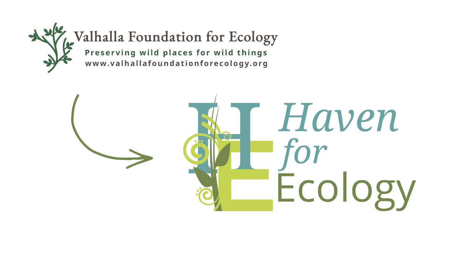
When the Haven team invited us in, they did not sugar-coat the challenge. They came to us with a brutally honest assessment: the former name created confusion in the community, and it pulled attention away from the actual work. They also named a deeper issue, which mattered just as much. “Valhalla” lands, for many people, as Viking warrior heaven. That association does not fit a land trust focused on protection, stewardship, and relationship.
That clarity from the start made the project easier. It gave us a strong brief, and it let us do what branding should do at its best: remove friction, reduce misunderstanding, and help the mission speak for itself.
The new name came out of a collaborative naming process: we proposed multiple naming directions, the organization’s Executive Director, Lorna Visser, added “Haven for Ecology” to the shortlist in an inspired move, and it won the board’s vote.
What follows is a behind-the-scenes look at how we approached the logo and the identity, and why the final mark looks the way it does.
Step one: start with what has to be there
Before we start with a new brand, we look at the non-negotiables.
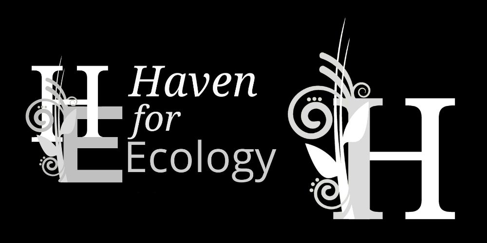
This identity needed to feel credible in a government document or an ecological report, and readable on a small social graphic. It needed to work in black and white, since real-world printing still happens. It also needed to stand up over time, because a land trust should not have to reinvent its public face every few years.
Step two: study the new name
A name is not a label, but a promise.
“Haven” communicates refuge and protection. It feels human, but it does not feel soft. Pairing it with “for Ecology” keeps the focus on land, water, habitat, and stewardship. It also brings continuity to this long-lived group whose former name also ended with “for Ecology”.
The best part of the name is that it does not need an essay to explain it. It tells you what they do, and it gives you a feeling that matches the work.
Step three: build a logo
A logo is not an illustration. It is a symbol that has to behave in dozens of contexts.
When we designed the Haven logo, we made decisions based on function first. We asked practical questions early, and we did not move forward until the mark could answer them with confidence:
- Can you recognize it at a glance?
- Does it stay legible when it is small?
- Does it reproduce cleanly in greyscale?
If the answer to any of those becomes “maybe”, the logo will fail in the real world, even if it looks nice on a large screen.
Step four: visual continuity, without staying stuck
One of the trickiest parts of a rebrand involves change management.
You want the new identity to feel fresh, but you do not want supporters to feel like the organization turned into someone else overnight. So our approach balanced continuity with correction.
We carried forward what already aligned with the mission in their latest brand image, then we rebuilt the visuals around the new name so the shift felt coherent.
Design rationale: what the Haven logo means
Below is a simplified version of the logo rationale we developed during the rebrand. These points explain the structure of the mark and the meaning behind the design decisions.
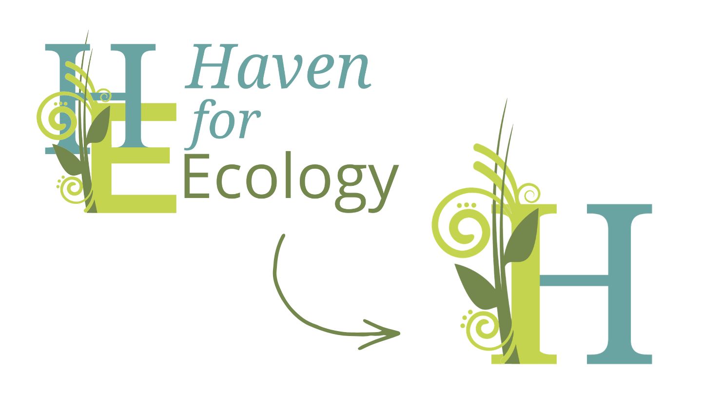
- The central “H” reads as two sturdy pillars. It signals structure, stewardship, and the human responsibility that holds long-term land care together.
- The nested “E” represents ecology. It sits inside the structure as a foundation or platform, which reinforces the idea that the organization exists in service of ecological protection.
- Together, the letters create a shelter shape. The form subtly echoes the idea of “a haven for ecology” without turning the logo into a literal house icon.
- The curling plant forms show living systems at work. They weave through the letters to reflect interconnection, growth, and the reality that the work happens within nature, not apart from it.
- Colour logic supports the story. Blue-green suggests air and water. Yellow-green signals new growth. Deeper green grounds the identity in mature ecosystems and long-term stewardship.
From logo to brand mark: why the “H” and “E” became one
Once the logo felt solid, we translated it into a mark that could work alongside the full name. That is where the “H” and “E” merge into one unit. The combined form creates a compact shorthand for Haven for Ecology that stays readable at small sizes, and it lets the brand show up consistently in places where the full name cannot. It helps the identity feel like one system instead of separate parts. It also reinforces the concept: ecology sits inside the structure, not beside it. The “E” lives within the “H,” which visually echoes the organisation’s mandate to protect and steward living systems over the long term.
What this rebrand really represents
On the surface, this is a name change, plus a new logo and brand guidelines.
Underneath, it is a shift toward clarity.
Land protection depends on trust. It depends on being understood by neighbours, supporters, partners, and funders. The new identity helps the organization show up with fewer explanations and more confidence, which frees up more energy for the work itself.
“Haven for Ecology” says what it means. The logo gives that meaning a stable symbol that can live on a sign, in a report, or on a hat without losing its message.
That is the goal of good branding: less confusion,and a clearer path for the mission to move forward.